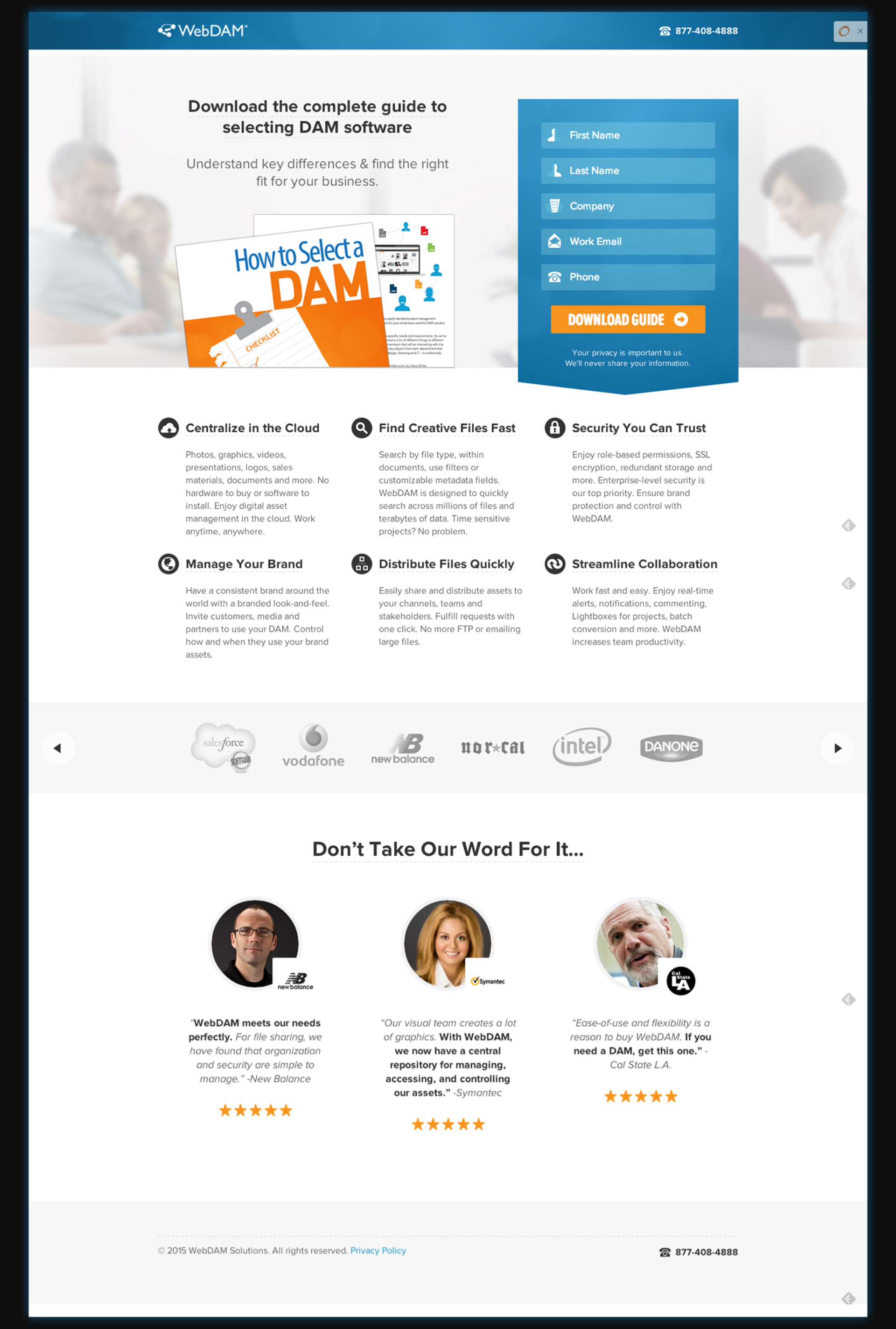
You may not think landing pages are sexy... but being a marketing nerd, there are some landing pages that just make me drool. They have all the parts in the all the proportions and places... and they bring in the leads like a Victoria's Secret Model would on any street corner.
So, I've found one that's drool-worthy that I'm going to undress right here, right now, so you can learn what makes it sexy 🙂
Without further ado... meet this sexy landing page...
Now... remember... the goal of a landing page is to get someone to fill out that form. (remember when we talked about that... [right here] ) Getting leads is the only job this page has.
Beautiful Design
This landing page is wearing all the right shades in all the right places...
- The form is set into a beautiful eye-catching blue background gradient that keeps pulling your eye back to it.
- The Download Guide button is backed by a bright orange that gets your attention even more (since orange is a complimentary color to blue)
- The other graphics are there, but they are faded, and subtle, so they don't take away from the glory of the form.
- They also show you stunning cover and inside pages from inside the book so you know what to expect.
Brains & Beauty
This page packs the winning combination of killer looks and brilliant content.
- There's a clear headline of what this page is all about... "Download the complete guide to selecting DAM software"
- That's followed up with a brief, but understandable explanation... "Understand the key differences & find the right fit for your business."
- Then if that doesn't have your motor revving, you could scroll down and see more reasons why you want it... examples of brands that use it... AND testimonials from people that use it.
- The icons in the form field make it easy to see what info goes where
- The "Download Guide" button gets away from the boring "submit" text we usually see and comes with arrow that makes you feel like you're moving forward when you click it
- The form makes sure you know that they won't share you information with anyone else, so you can get your ebook and leave in peace.
Focused on the Goal
It also implements all of the landing page best practices to help it convert more leads.
- It sticks to the 2-5 form field rule of thumb. You want to ask for enough information to help you qualify the lead, but not so much information that they run screaming and won't fill it out.
- The primary navigation is gone... so the visitor has three options. 1) fill out the form 2) call them 3) go away
- They keep the form and "what you get by filling out the form" text above the fold... the fold being everything you can see without having to scroll down.
So... there you have it. A step-by-step walk through of what it takes to make a sexy landing page that brings you leads.
Did you learn something? What was your favorite tip? Leave a comment letting us know!